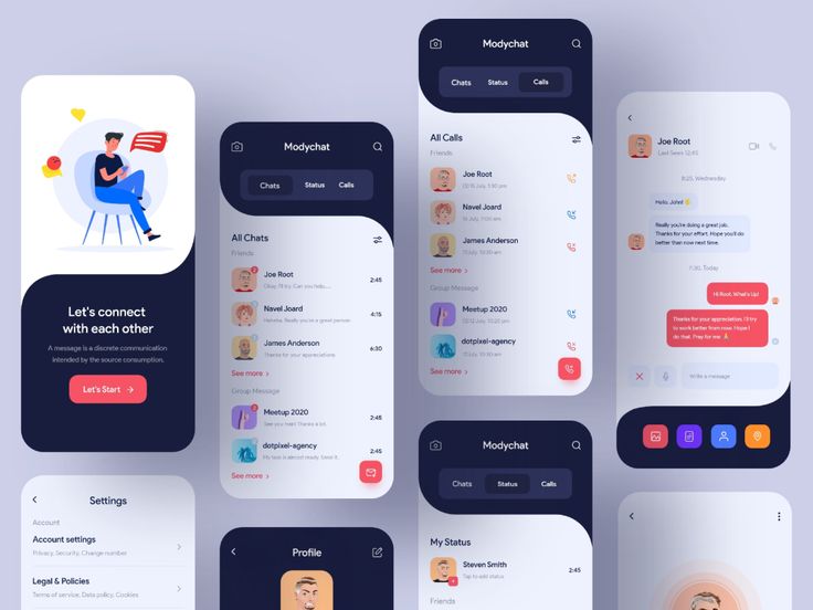
Mobile UI Designing – The graphical and generally touch-sensitive display of a mobile device, such as a smartphone or tablet that allows the user to interact with the device’s apps, features, content, and functionalities is known as a mobile user interface (mobile UI Designing).
Website designing requirements for mobile user interfaces (UI) differ greatly from those for desktop computers. Because of the lower screen size and touch screen capabilities, UI design must take proper care to ensure usability, readability, and consistency. Symbols may be utilised more extensively in a mobile UI designing interface, and controls may be automatically concealed until they are accessed. The symbols themselves must be smaller, and there isn’t enough place on anything for text labels, which can lead to confusion.

Mistake to Avoid While Mobile UI Designing
Inadequate Orientation
User retention requires a user-friendly interactive mobile UI/UX designing. By avoiding complex navigation and UI Design Mistakes, a developer can give the best first impression possible. A simple on boarding instruction is adequate to provide the appropriate experience for the multi-feature application.
Fonts and their significance
The two qualities that differentiate a good mobile UI designing are fonts and style consistency. Typography accounts for 95 percent of all site design. If you get it incorrectly, you’ll lose between 12% and 20% of your potential consumers. You may improve readability, usability, and accessibility by improving typography.
Always choose the readable typeface above the fashionable one. Despite their popularity, thin, light fonts should be avoided. They are, after all, elegant, clean, and contemporary. However, they may not render appropriately on various display kinds and remain illegible for many users.
Poor Navigation Design
Even if you develop the perfect onboarding experience, it won’t matter if your customers can’t find features or navigate your app. Someone should be able to identify where they want to go and how to get there fast when they first download your app.
Identifying the type of navigation to use is a crucial step in creating easy navigation. What’s on the hamburger menu? Is there a tab bar on the screen? Is there a multi-level responsive navigation system? The navigation should be smoothly integrated into the app’s structure, rather than pulling attention away from the content.
Creating a Cluttered User Interface
Overcrowding the design with buttons, images, videos, text, and other features is another common mistake committed by first-time businesses. As a result of the visual overload, the software may appear too difficult, resulting in a poor user experience.
Eliminating visual clutter and striving for minimalism is a better strategy. Just as you did with your core app features, you should focus on the visual information that is essential to your user and remove unnecessary aspects that do not match your user’s final goal.
Poor iconography
Icons appear to be the easiest aspect of the design at times. Some designers even regard them as an additional ornamental element, despite the fact that they are an integral aspect of current user interfaces. You’ll find an interface that’s primarily made out of icons, especially on mobile UI designing, where icons are the counterpart of buttons.
That’s why it’s critical to pick the correct symbol for each piece that clearly communicates its meaning, and to maintain the icon style consistent throughout your programme.

Inconsistency in your UI elements
Avoid utilising too many different styles to achieve a smooth and succinct app. Your users will receive confused signals as a result of this! The objective is to keep repeating patterns and pieces whenever possible. A consistent design goes a long way toward establishing trust and generating a pleasant experience for your visitors. Furthermore, it will assist your customers in learning how to use your app much more quickly.
Using low-quality images
Choose a great image that complements the message and the appearance of your app when using photos in your interface to communicate a story. The ultimate goal of UX for Mobile Application Designing is to create user interfaces that are both intuitive and appealing. It must build trust in order to increase conversions. Keep all of these blunders in mind as a checklist of things to avoid when designing, and you’ll soon discover that you’ve mastered these design concepts and don’t need that list in front of you.
Conclusion
The ultimate goal of mobile UI designing is to create user interfaces that are both intuitive and appealing. It must build trust in order to increase conversions. Keep all of these blunders in mind as a checklist of things to avoid when designing, and you’ll soon discover that you’ve mastered these design concepts and don’t need that list in front of you. You can check mobile UX design usage to amaze your users.
Striking a balance between design concerns and coping with the unique requirements of different apps can be difficult. Furthermore, an app’s user interface should be tailored to each mobile UI designing OS, as this is the visual language that the device user would be most familiar with. For that purpose, mobile OS developers typically give resources for mobile UI designing to become familiar with how their OS handles user interfaces.